
Rmor – by Roopam
Analytics Lab – R
Welcome back to Analytics Lab on YOU CANalytics! In our last article, we learned the procedure to visualize risk across a parameter (age groups) in Excel. In this part we will generate the same visualization in R. This lab exercise is a part of the banking case study we have previously worked on (you will find links to the banking case series at the bottom of this article).
Banking Case Study
Recall the banking case: in that you were playing the role of the Chief Risk Officer (CRO) for CyndiCat bank. The bank had disbursed 60816 auto loans in the quarter between April–June 2012. Additionally, you had noticed around 2.5% of overall bad rate for these loans. The idea was to identify customer segments with distinct bad rates. Bad rate, by the way, is percentage of customer defaulted on their payments. You did some exploratory data analysis (EDA) using tools of data visualization and found a relationship between age with bad rates (Part 1). If you recall, in the previous article we have generated the following plot on Excel. The plot collectively depicts age groups wise population distribution and bad rate trend. As mentioned above this time we will create a similar plot on R. 
Pep Talk before Jumping into R
If this is the first time you are using R & R studio then don’t get intimidated with this brilliant tool for analysis – you will love it once you get familiar with it. R is a language and computing environment for statistics, analysis, data mining, and graphics. If you have used Excel functions (such as =vlookup(), =sum() etc.) then you will find R commands / functions somewhat similar.
R & R Studio
First of all (if you don’t have R and R Studio), you need to download R (link) and R Studio (link) from the given links and install them on your computer. By the way R Studio is an excellent free editor to work with R language. You will find good documentation for R Studio at this link. Additionally you will need the following CVS (data) file to work on this example.
YOU CANalytics R Visualization (click on the link to download the file)
Moreover, you can find the entire R code in the following text file. But wait and read on before you check out this text file.
R Coding
I recommend that you copy and paste the individual lines of code given below in R Studio console (located at the bottom left of R Studio panel as highlighted in the below picture), and execute them one-by-one. In R (unlike C, Java, and other similar languages) one doesn’t need to compile the entire code to produce results – each command in R is executed independently.

The first line of the code is importing or reading the CVS file in the R environment. You will need to modify the path of the CVS file based on the location of the file on your computer. The extracted CVS file is named ‘data’ in the R environment.
data<- read.csv("C:/Users/Roopam/Desktop/YOU CANalytics Visualization R.csv")
Now in the next three lines of code we are going to assign variable names x, y1 and y2 to ‘Age Groups’, ‘Number of Loans’, and ‘Bad Rate’. These three variables are present in the ‘data’ file. Also, you could view this data in R using the command View(data)
x <- data$Age.Group
y1 <- data$Number.of.Loans
y2 <- data$Bad.Rate
‘Par’ function in R is used to realign plots. In this case mar operator is used to realign margins in the subsequent plot(s). You should play around with the numbers in the function to see the change in the plot, although you will see the impact of this command after you plot the bar plot through the next line of code. By changing the values inside ‘c()’ plots will move according to c(bottom, left, top, right) on the graph canvas.
par(mar = c(5,5,2,5) +.1)
Now, we will plot our first bar plot using barplot function. Notice you could create a bare bones bar plot using this command barplot(y1, names.arg=x). The other arguments within the barplot function in the following command are used to produce cosmetic effects in the plot. I recommend that you play around with the other arguments in the barplot function.
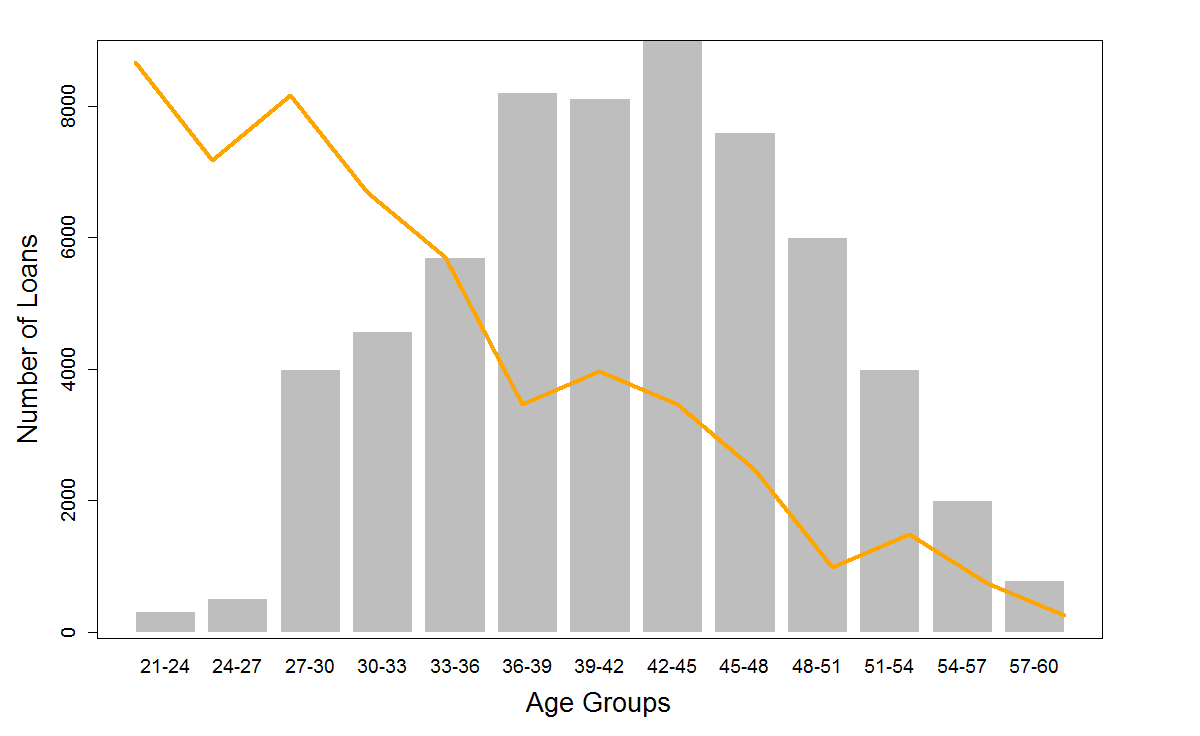
barplot(y1, col="grey", border=0, names.arg=x, angle=45, xlab="Age Groups", ylab="Number of Loans", cex.lab=1.7, cex.main=1.7, cex.sub=1.7, cex.axis=1.2, cex.names=1.2)
The following plot is generated using the above command. 
Again we will use ‘par’ function to overlay a line plot on top of the bar plot. We will use the following command:
par(new=TRUE)
Now, we will draw a line plot using the following command. This new plot will be overlaid on top of the previous bar plot because of the above par statement. In the plot command type=”l” argument tells R to draw a line graph, with orange color (col=”Orange”) and thicker line width (lwd=5).
plot(y2, type="l", col="Orange", lwd=5, xlab="", ylab="", xaxt="n", yaxt="n")
The following plot will be generated using the above set of commands.
Penultimately, we need to format the new Y axis and label it “Bad Rate”. This is precisely what we are doing through the following two commands.
axis(4, cex.axis=1.2)
mtext("Bad Rate",side=4, line=3, cex=1.7)
The result of the above two commands is labels for the Y axis for ‘Bad Rate’on the right as shown below.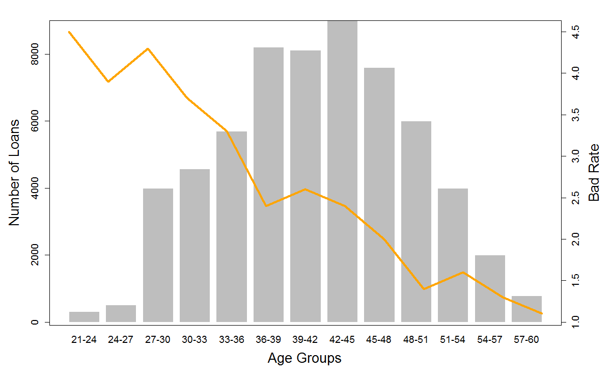 Ultimately, we will place a legend on the top right corner of the graph to make it more friendly to read. We will do it using the legend function as shown below.
legend("topright", col=c("orange"), lty=1, lwd=5, legend= c("Bad Rate"), cex=1.25)
This has completed our exercise and we have the final plot that we were looking for.

Sign-off Note
Hope you had fun while creating the above plot on R. We will soon learn to do some more serious stuff on R as part of ‘Analytics Lab’. See you soon!
The following are the parts of the banking case study for risk scoring
- Part 1: Data visualization for scoring
- Part 2: Creating ratio variables for better scoring
- Part 3: Logistic regression
- Part 4: Information Value and Weights of Evidence
- Part 5: Reject inference
- Part 6: Population stability index for scorecard monitoring
Nice. Looking forward for other articles.
Thanks