Welcome back to the case study example for regression analysis where you are helping an investment firm make money through property price arbitrage. In the last two parts (Part 1 & Part 2) you started with the univariate analysis to identify patterns in the data including missing data and outliers. In the discussion section of the last part, Katya, Chetan, Abhishek and VC started an interesting discussion about the pros and cons of removal of missing data. I have a few opinions on missing data but let me reveal them later, for now I am really enjoying reading your ideas. Thanks, and please keep sharing your ideas.
In this part you will further your investigation through bivariate analysis. Bivariate analysis will eventually help you develop multivariate regression models in the latter parts of this case study example. Through the bivariate analysis you will also identify how outliers can play havoc for your analysis. However, before that let’s discuss:
Archimedes and Leverage in Regression

Archimedes in his famous quote was referring to the phenomenon called leverage. It is easy to experience leverage if you try to open a door from the three different points (A, B, and C) displayed in the adjacent picture. You will notice that it requires much lesser effort or force to open the door the further you move away from the door hinges. This is the reason a door knob is placed as far away from the hinges to reduce your effort every time you open or close the door.
Leverage plays an important role in regression models as we will notice in the next sections.
Bivariate Analysis – Regression Case Study Example
Let’s come back to our case study example where you are a data science consultant for an investment firm. You are working with this data set to estimate property price through regression modeling. In this part of the case study, you will do bivariate analysis between the numeric response variable (house_price) and the remaining prospective predictor variables in this data set. The bivariate analysis has different approaches based the nature of predictor variables i.e. numeric or categorical. Before we continue with our analysis let’s revisit some core concepts of correlation analysis and scatter plots to analyse numeric predictor variables.
 Correlation Analysis & Scatter Plot
One of the important measures while we perform bivariate analysis between 2 numeric variables is the correlation coefficient. Relation is the operative word here. This coefficient represents relationship between the 2 variables. The range for correlation coefficient is between -1 and 1. The closer the correlation coefficient to 1 (i.e. 0.9 or 0.85) the higher positive relationship the two variables have. Positive relationship means if the first variable grows than the second variable also grows. An example for positive correlation is age and height of teenagers.
Similarly, the closer the correlation coefficient to -1 (i.e -0.95 or – 0.8) the higher negative relationship the two variables have. As you must have guessed for the variables with negative correlation coefficient if the first variable grows than the second variable shrinks. An example for negative correlation is your expenses and savings with a fixed income.
Moreover, when the value of correlation coefficient is close to 0 (i.e. 0.01 or 0.05) then it represent there no or very little relationship between the 2 variables.
In the next segment we will revisit our case study example and see how correlation coefficient can be misleading in the presence of outliers. We will also connect this to leverage, the concept we discussed in the previous segment.
Correlation and Leverage – Regression Case Study Example
Now let’s get back to the dataset you are analyzing for your client. You had started with scatter plots of carpet area and house price with and without the outliers. You are particularly interested in the correlation coefficients which you have placed at the top of these plots.
You noticed that the extreme outlier (a mansion among the middle class houses) has a massive leverage over the other observations. This has a huge impact on the correlation coefficient as well. Essentially, in the presence of this outlier you are drawing the regression line between two dots on the scattered plot : the extreme outlier and the whole bunch of data clubbed together (Exhibit 1). This is the reason the correction coefficient in this case is very close to perfect correlation i.e. 1. In Exhibit 2, when this outlier is removed the bunched up data looks like a more realistic scattered plot.
Now, you want to analyse all the numeric predictor variables against the response variable (house price) all at once. You will create scatter plots and correlation coefficeints in the matrix format. Keep an eye for correlation coefficient and scatter plot for carpet area and house price you had already analysed in the above animation.
R-code to create : matrix plot with both scatter plot and correlation coefficient.
You have opted to remove the observation for the large mansion from our dataset before the development of regression models. The matrix scattered plot without the outlier looks like this.
Check out the histograms for all the numeric variables at the diagonal panels of this matrix plot. They all look well centered and nicely distributed. This gives you a good confidence to move further with our analysis.
If you look at the above matrix plot carefully you will also notice that distance between taxi stand, market, and hospital have significantly high correlations. Moreover, carpet and built-up area has almost perfect correlation. This indicates that in our data-set the build-up area is a derived field from the carper area because such a high correlation is almost impossible for a natural phenomenon. This is all pointing towards high correlation between predictor variables – the phenomenon is also known as multicollinearity. We will explore more about multicollinearity in the next part when we will discuss principal component analysis. For now, let’s move further with bivariate analysis between categorical predictor variable and house price.
Bivariate analysis – Categorical Predictor Variables
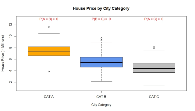
You have 2 categorical variables in our data-set: city category and parking availability. A good way to analyse categorical predictor variables and numeric response variable is through a box plot. We can clearly see that there is a significant difference between the average price of houses based on the category of cities. The average prices are shown as in the middle of the boxes. R code : bivariate analysis – categorical variable.
Moreover to validate what you see in the box plot, you have performed pair-wise t test for each category. The results for pair-wise t-test shown at the top of the box plot in red. You noticed that P(A=B)~0 means that there are almost 0% chances that average price of houses in cat A city is equal to cat B city. Go ahead and plot a similar chart for parking and house prices. Also, let us know what you see.
Sign-off Note
Archimedes did not find an enormously long lever and a place far-far away to move the earth. However, he did shake the earth with his ideas and had a leverage over the scientific thinking.
In the next article, we will progress with multivariate regression model. The bivariate analysis in this part has already offered clues about the structure of our final model.


Thanks Roopam for the clear exploratory analysis.
Thanks a lot Roopam for the article. Could you please also refer good literature for PCA?
Also, i have following questions:-
1) Information Value along with WOE is also used to find significant variables. What is the difference between PCA and IV and what are the application between both?
2) With which all models can we use PCA e.g. can we use PCA with unsupervised learning, such as, clustering and segmentation algorithms to determine significant variables?
PCA and IV have completely different utilities, and one of them can’t be seen as a replacement for the other. As you rightly said, IV is to test the predictive power of a variable. Principal component analysis, on the other hand, is used for variables reductions and removing multicollinearity. PCA is sort of similar to variable clustering. Read the next post of this series on PCA.
Unlike category, parking categories are very correlated to each other. With respect to every parking category, mean/median house price is around 5.5 million to 6.5 million.
Data can be divided into three groups, when filtered by city category as it can be divided into three disjoint clusters. But data cannot be divided into further groups w.r.t parking type as the groups are very much correlated.
My conclusion is that City category has more variance than parking area which helps us in giving importance to city category especially which building a regression tree.
Very nice article, just love the simplicity to explain the concept
Very useful for anyone who wants to use data science concepts.